It’s hard to overemphasize just how much our world looks the way it does because of typographer Mike Parker, the “godfather of Helvetica,” who just passed away. From his obituary in the Economist:
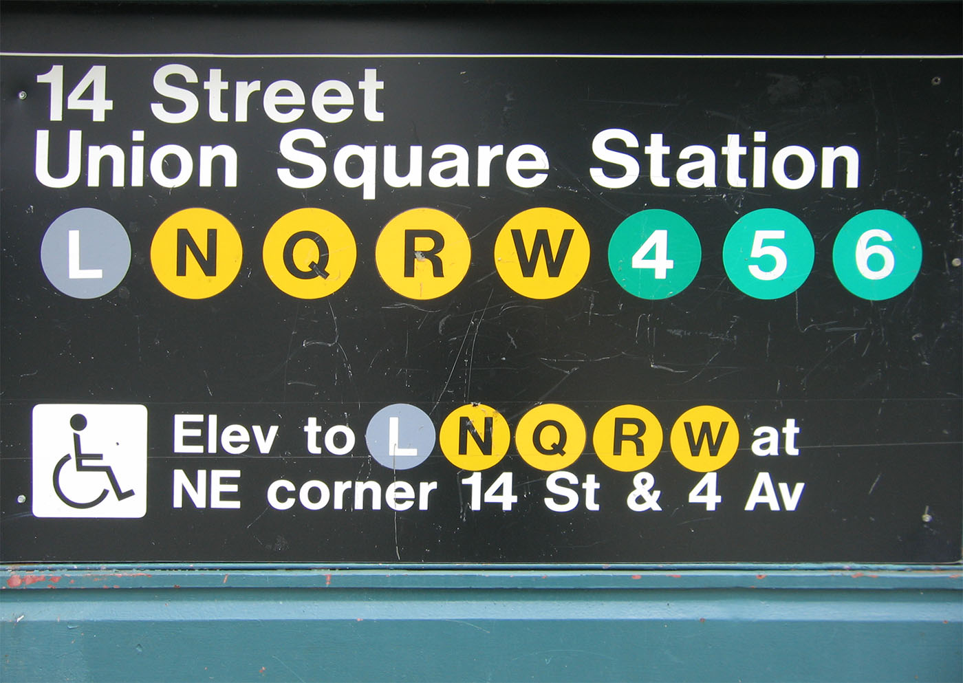
“Of the more than 1,000 types he developed, his greatest success was Helvetica. It was he who adjusted it, or corralled it, to the needs of the obdurate, cranky, noisy Linotype machines which then printed almost everything in America. Originally it was the brainchild of a Swiss designer, Max Miedinger, who devised it in 1956. In contrast to the delicate exuberance of 16th-century types, Helvetica was plain, rigidly horizontal—and eminently readable. It became, in Mr Parker’s hands, the public typeface of the modern world: of the New York subway, of federal income-tax forms, of the logos of McDonald’s, Microsoft, Apple, Lufthansa and countless others. It was also, for its clarity, the default type on Macs, and so leapt smoothly into the desktop age.
Not everyone liked it. He did not always like it himself: as he roared around Brooklyn or Boston, opera pumping out at full volume from his car, he would constantly spot Helvetica being abused in some way, with rounded terminals or bad spacing, on shopfronts or the sides of trucks. But far from seeing Helvetica as neutral, vanilla or nondescript, he loved it for the relationship between figure and ground, its firmness, its existence in ‘a powerful matrix of surrounding space.’ Type gave flavour to words: and this was a typeface that gave people confidence to navigate through swiftly changing times.”
______________________
“What did Helvetica tell you today?”:
Tags: Max Miedinger, Mike Parker