I don’t understand why children can’t go into bars or buy cigarettes, but they can eat at fast-food restaurants. It ingrains in them at an impressionable age as unhealthy a lifestyle as can be. I have no problem with adults who choose to do these things, but I don’t get how we draw the line with kids to allow them to stuff huge amounts of salt and sugar into their hearts.
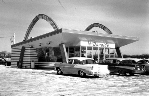
That said, I’ll acknowledge that I’ve always been entranced by the branding and design of fast-food places: the consistency, the brightness, the modernism, the formerly industrial materials being wound into a homey decor in a way that Ray and Charles Eames could appreciate. It’s the perfect meeting of form and function. Don’t get me wrong: Even if I wasn’t a vegetarian, I would not eat this garbage, and the implications of its globalization also bother me. But I do love the architecture and design of such places, especially the earliest iterations.
From Jimmy Stamp’s Smithsonian blog post, “Design Decoded: The Golden Arches of Modernism,” an excerpt about the initial McDonald’s structures, which were planned and executed during the apex of roadside culture:
“In the early 1950s brothers Richard and Maurice McDonald hired architect Stanley Clark Meston to design a drive-in hamburger stand that carried on the traditions of roadside architecture established in the 1920s and 1930s. They had some experience with previous restaurants and a very clear idea of how they wanted their new venture to work – at least on the inside. Meston described the design as ‘logically dictated by clear program and commercial necessities’ and compared it to designing a factory. Though he didn’t necessarily consider himself a modernist, Meston’s pragmatic, functionalist approach reveals, at the very least, a sympathy with some of the tenets of Modernism. Function before form. But not, it would appear, at the expense of form.
And anyway, the exterior had its own function to fulfill. In an age before ubiquitous mass media advertisements, the building was the advertisement. To ensure the restaurant stood out from the crowd, Meston decided to make the entire building a sign specifically designed to attract customers from the road. Now, many architects have speculated that McDonald’s iconic Golden arches have their origin in Eero Saarinen’s 1948 design for the St. Louis Gateway Arch or Swiss architect Le Corbusier’s unbuilt 1931 design for the Palace of the Soviets. But they tend to read little too much into things. The answer is much simpler.
The building was a sign but it wasn’t really signifying anything – other than ‘hey! Look over here!’ According to Hess, the initial idea for the golden arches –and they were called ‘golden arches’ from the very beginning– came from ‘a sketch of two half circle arches drawn by Richard McDonald.’ It just seemed to him like a memorable form that could be easily identified form a passing car. The longer a driver could see it from behind a windshield, the more likely he or she would be to stop. Oddly enough, the idea to link the arches, thereby forming the letter ‘M’, didn’t come about until five years later. McDonald had no background in design or architecture, no knowledge of Eero Saarinen, Le Corbusier, or the triumphal arches of ancient Rome. He just thought it looked good. Weston turned that sketch into an icon.
Technology has long conditioned urban form and continues to do so today. But this was perhaps never quite so clear as it was with roadside attractions and restaurants like McDonalds.”

