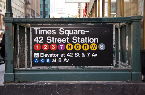
The graphic designer Massimo Vignelli, who passed away nearly a year ago, left a mark on New York City that’s dwarfed only by those on the level of Robert Moses and Frederick Law Olmsted. Here’s an excerpt from a 2006 Gary Hustwit interview with Vignelli (republished by Fast Company) in which the man who somehow made sense of our serpentine subway comments on the impact of modern machines on signage:
Question:
What’s your opinion of the impact of the computer on typography?
Massimo Vignelli:
In the ’60s, we were taking Standard and cutting the sides of the letters in order to get the type tighter. A good typographer always has sensitivity about the distance between letters. It makes a tremendous amount of difference. We think typography is black and white. Typography is really white, you know. It’s not even black, in a sense. It is the space between the blacks that really makes it. In a sense, it’s like music—it’s not the notes; it’s the space you put between the notes that makes the music. It’s very much the same situation.
The spacing between letters is important, and the spacing between the lines is important, too. And what typographers do, what we do all the time, is continuously work with those two elements, kerning and leading. Now, in the old times we were all doing this with a blade and cutting type and cutting our fingers all the time. But eventually, thank God, the Apple computer came about. Apple made the right kind of computer for the communication field. IBM made the PC, and the PC was no good for communication. The PC was great for numbers, and they probably made studies that there were more people involved with numbers—banks, insurance companies, businesses of all kinds. But they made a tremendous mistake at the same time by not considering the size of the communications world. That community is enormous, you know—newspapers, television, anything that is printed. It’s enormous. Advertising, design, you name it.
Anyhow, Apple, thank God, got the intuition of going after that market, and so in 1990 they came out with a computer that we designers could use. Now, let’s face it: the computer is a great thing, but it’s just a tool, just like a pencil is a tool. The computer has much more memory, the pencil has no memory whatsoever, and I have even less. But it is a fantastic tool which allowed the best typography ever done in the history of typography, because you can do the kerning perfectly for the situation. You can do the leading perfectly for whatever you’re encountering. Not only that, but you see it right away; you can print it right away. It brings immediacy to your thoughts, and that is something that never happened before in the history of mankind.
It allows you to do the best typography ever, but it also allows you to do the worst ever.•
___________________________
“It’s the space between the notes”:
Tags: Gary Hustwit, Massimo Vignelli

